
Role
Creative Director
Timeframe
2016
Discipline
Branding · Product Campaign · Trade Show Signage · Collateral
The Challenge
In the stroke OR, seconds decide outcomes, and staff identify devices by color on sight. Stryker Neurovascular was selling a fragmented portfolio of individually branded products with no system tying them together. Hard to recognize under pressure, and harder to sell as one division.
The Approach
I simplified the brand architecture into a single divisional brand, with power brands organized by procedure type and product colors preserved where clinicians relied on them. Performance sports became the organizing metaphor: precision, endurance, and high stakes that mirror how neurosurgeons work, with enough range to flex across a large portfolio.
One brand, built for the OR
Color coding stayed, because that is how devices get found in a hurry. Everything else was rebuilt to work as one system, from the shelf to the trade show floor.
A performance-sports campaign
The metaphor gave the brand range — one system that carried from a rock face to a ski course to the trade show floor, tying each device to a feeling of precision and endurance.
Target detachable coils
The sports metaphor carried into product storytelling — a sales presentation that moved from a single confident idea to the technical detail a neurosurgeon needs to compare shape, size, and softness at a glance.
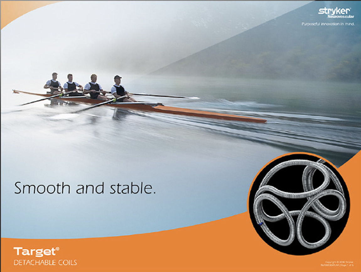
Smooth and stable
Results
- 01Turned a collection of products into one cohesive, performance-driven brand
- 02Consistent color coding and design language improved recognition in the OR and at trade shows
- 03The sports-inspired campaign resonated with surgeons around precision and endurance, driving engagement across digital and event channels
- 04Adopted globally across marketing and sales, unifying messaging and reinforcing Stryker's reputation for speed when it matters most
Next project
Crystal Geyser — Sparkling Alpine Spring Water launch