Role
Creative Director
Timeframe
2012-2016
Discipline
Brand identity · Logo design · Packaging · E-commerce
The Challenge
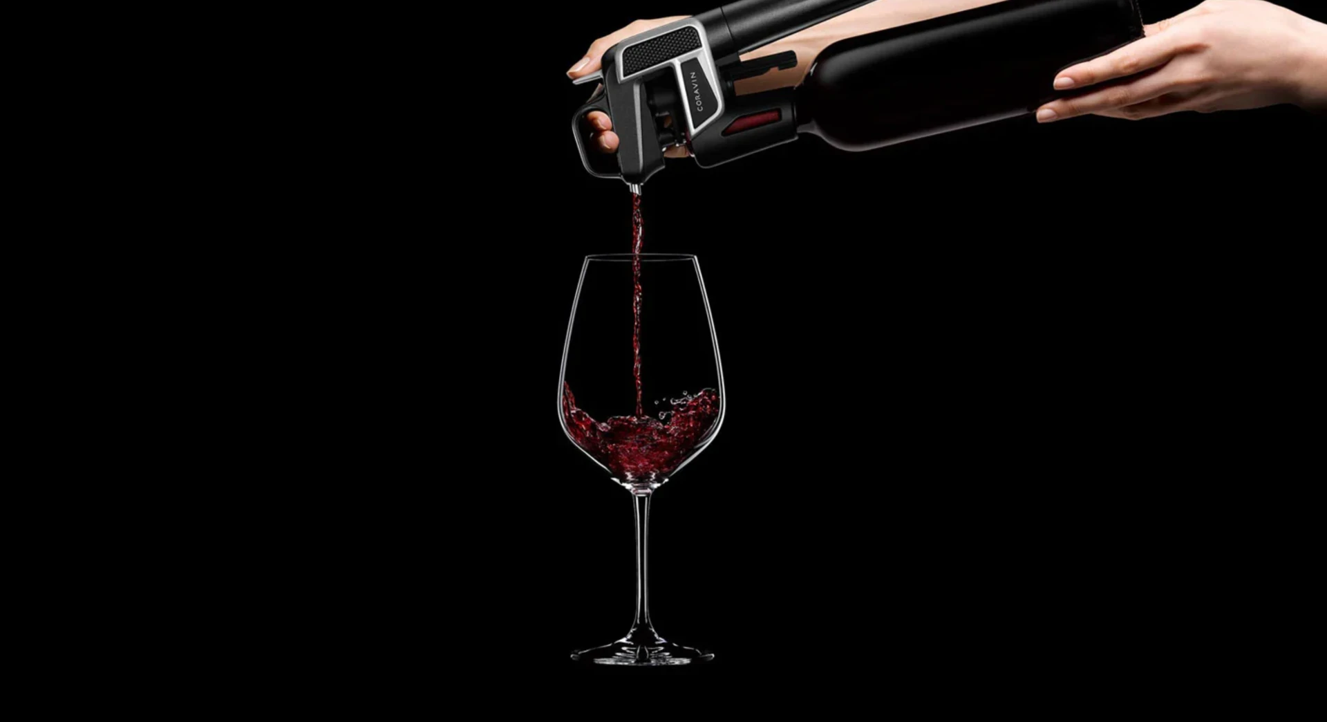
Wine is a category built on ritual. Cork, patience, a little ceremony. Coravin's device is a pressurized needle that punctures the cork and pushes argon in behind the pour, which is, described plainly, machinery. Set on a table surrounded by stemware it could easily have read as a tool, or worse, as something clinical. The brand had to earn a place next to the bottle.
The Approach
The answer came from the automotive side. Sportscars solve this exact problem, engineering that has to read as luxury instead of apologizing for itself, and they solve it with a specific vocabulary: a winged emblem, a badge set into the body, lacquered finishes, brushed metal against matte black. The mark is built as an emblem first. Everything downstream follows the same rule. Precision on display, never hardware on display.
An emblem, not a diagram
Winged marks are the oldest shorthand for automotive prestige, which is precisely the borrowed authority the product needed. The needle and the single drop it draws live inside the form, but they arrive second. You read the wings first and the mechanism only if you care to look.
One line, two jobs
The positioning line and the promise line share a lockup. One tells you what to stop doing. The other tells you what you get to keep.
Near-black, white, one crimson
The palette holds at three. Near-black grounds every surface, white carries the instructional work, and one crimson does the rest. It behaves like automotive paint, deep and structural on the mark, hot and lacquered on product. Nothing else in the system is allowed to be warm.
Packaging as the first proof
The box had to read as instrument, not gadget. Matte black, the mark alone near the top, a crimson spine to find it on a shelf. Closer to a watch box than an appliance carton.
The line, named and ranked
Model Two. Model Two Elite. Timeless Model Six+. Trim-level naming borrowed wholesale from cars, with finish doing the tiering before price does. Red, gold, and chrome are colorways, not options.
Teaching without jargon
Most of the digital work is instructional. Three numbered frames for the pour. A stripped diagram for the hardware. One chart that puts four weeks and two-plus years on the same axis as the bottle you opened last night. The comparison is the whole argument.
Results
- 01Identity carried across packaging, retail, and e-commerce
- 02Sold roughly 40,000 devices after launch, double the company's forecast
Next project
DxD HealthTech — Naming and identity for diversity in healthtech