Role
Creative Director
Timeframe
2019
Discipline
Naming · Brand identity · Brand guide · Website · Campaign
The Challenge
Diversity work in healthtech had no shortage of statements. What it lacked was a partner that turned intention into practice. The identity had to read as credible to medical device executives and genuinely welcoming to the people it was trying to reach — serious enough for a boardroom, warm enough that no one in the room felt lectured.
The Approach
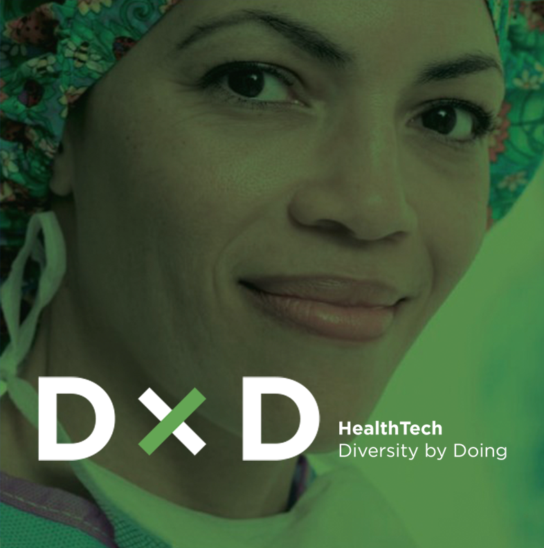
The name came first and did most of the work. Diversity by Doing puts the verb in the title. The mark builds directly from it — two D's joined by a multiplication X, so the relationship reads as amplification rather than opposition, with a single green stroke carrying all the warmth the system needs. The guide codified an archetype, a set of attributes, and a deliberately narrow palette, so everything downstream — website, seminar campaign, social — arrived already on brand.
A name that is also an instruction
Most diversity branding leads with a sentiment. This one leads with a verb. Diversity by Doing sets the expectation in three words, and the mark follows the same logic — a multiplication sign between two D's, not a cross-out. The work compounds.
Built from the guide up
The guide did the strategic work before any asset existed — a positioning statement, a set of attributes, and an archetype specific enough to settle arguments. Ruth Bader Ginsburg: measured, relentless, unmistakably credible. Every tonal decision downstream traces back to that page.
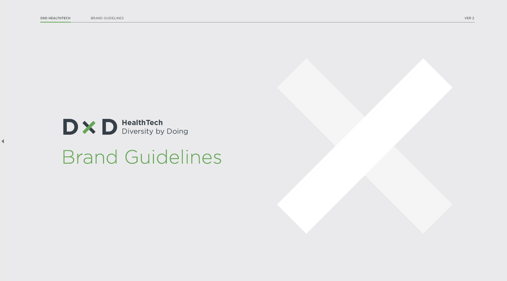
Brand guide cover
A disciplined system
Deep grey and one bright green carry the brand; the accents stay in reserve. Clear space is defined by the height of the X itself, so the mark holds its authority at any size, on any ground.
The system in the world
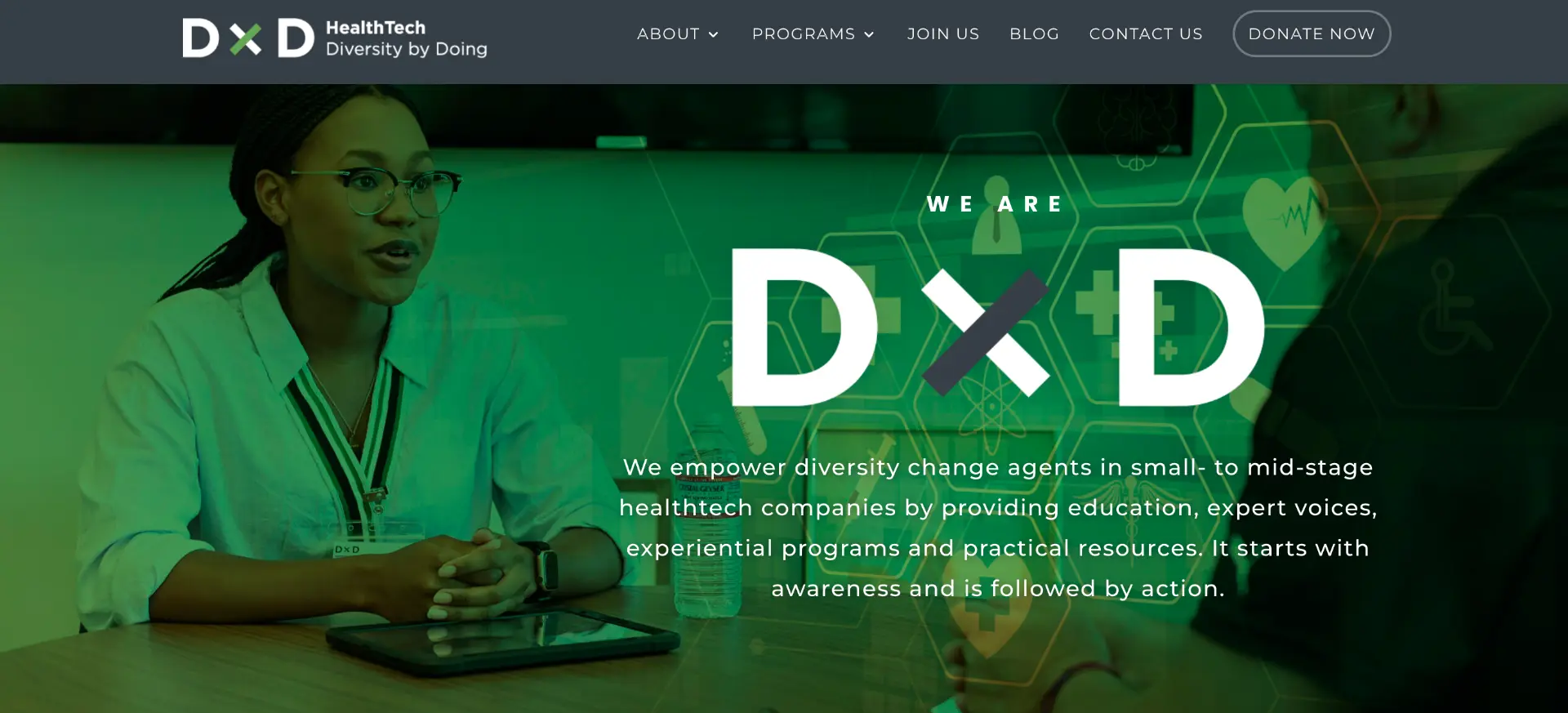
The website leads with the same statement the guide opens on, set over people actually doing the work. Green does the heavy lifting; the mark stays small and certain in the corner.
 Scroll
From identity to program
The proof of an action-first brand is a program someone pays to attend. A six-part DEIB seminar series, built with the Medical Device Manufacturers Association, took the system into a real campaign — the X locked into a corner cut, the green carrying the schedule, the whole thing legible at a glance in a LinkedIn feed.
Social media and events
Results
- 01Name, mark, and brand guide adopted across web, social, and partner-facing materials
- 02Six-part DEIB seminar series campaign delivered in partnership with the Medical Device Manufacturers Association
- 03One system carried from guide through the website to nonprofit programming, webinars and events
Next project
Genomic Health — Oncotype DX patient campaign