
Role
Creative Director — agency team
Timeframe
2021
Discipline
Positioning · Messaging · Identity · Photography · Website
The Challenge
Since 1998, The Foundry has been turning unmet clinical needs into companies — a dozen-plus startups formed, billions in shareholder value returned, technologies that are now standard of care. But the website had aged into its own founding year: framed navigation, clip-art headers, dense text, and a team page that buried the most credentialed people in medtech under a wall of links. Inventors, physicians, and investors were meeting a brand that told them nothing about the caliber of the firm behind it.
The Approach
We started with who they actually are — entrepreneurs, not incubators. They don't just fund ideas; they build the companies, staff them, and stay until each one can stand on its own. That single distinction became a messaging platform, a style guide, an original photo library shot inside their own lab, and a new website built to carry all of it.
Same firm, same track record, twenty-three years apart. Nothing about the original site suggested the companies behind it.
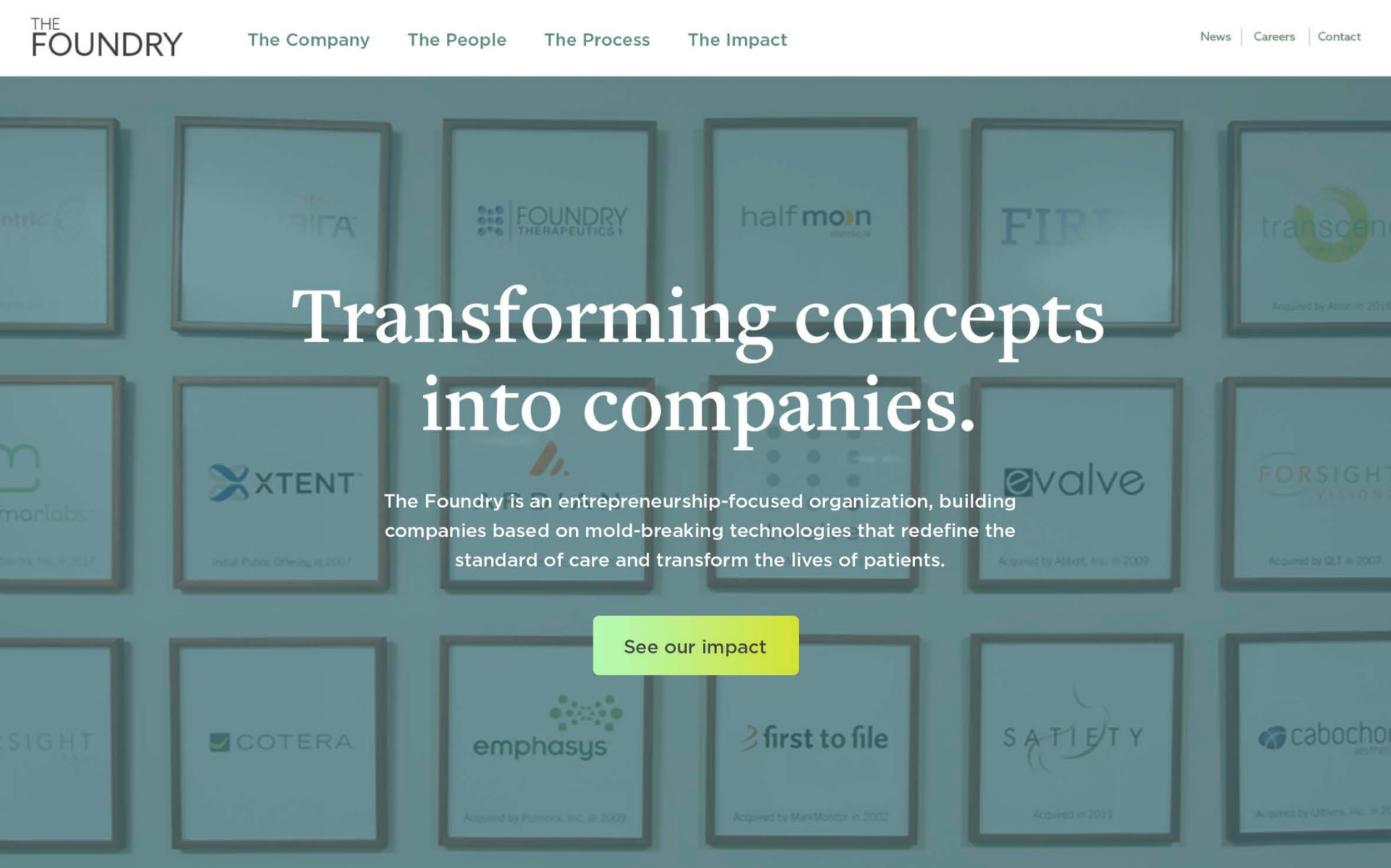 After
After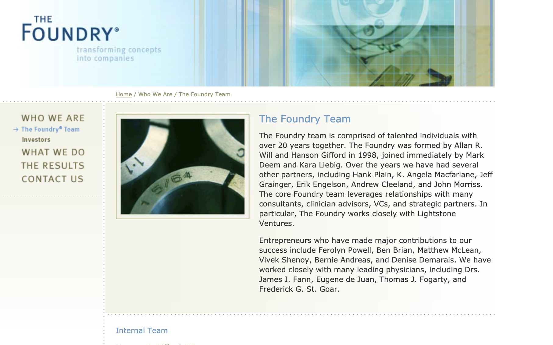 Before
The positioning
Strategy landed on one thing the firm had never claimed out loud: they are entrepreneurs, not incubators. Revolutionary, not evolutionary. They don't just talk — they build. Everything downstream was engineered to prove that.
The messaging
Transforming concepts into companies.
Revolutionizing the standard of care.
An elegant solution to a compelling clinical need is the foundation of a great business.
A messaging platform written for three audiences at once — inventors deciding where to bring an idea, physicians deciding whether to collaborate, and investors deciding where to place capital.
A quiet, confident wordmark set in Tofino, a base of warm white and graphite, and a teal-to-lime gradient that carries the system — built so a firm of ten could hold the brand together without a design department.
The palette
Warm white
#F5F5ED
Graphite
#3F403F
Signal lime
#C0D774
Deep teal
#068BA0
Four colors and one gradient. The teal-to-lime ramp does the heavy lifting — it washes over photography, backs every call to action, and makes any asset read as The Foundry at a glance.
The photography
The old site ran on stock. We shot the brand from life inside The Foundry's own lab — the benches and clean rooms, the devices in process, and the people who build them. Everything on the new site is theirs.
The website — scroll to explore
One scrolling story: what they do, how they do it, who does it, and what it has added up to. The homepage opens on the portfolio wall — every company they've built in a single frame — because the track record is the argument.
Results
- 01One brand system — style guide, messaging platform, photography, and website — replacing two decades of accumulated one-offs
- 02An original photo library of the space, the products, and the people, ending the firm's reliance on stock imagery
- 03A homepage that leads with the proof: the portfolio wall of every company they've built
Next project
VISIE — Rebrand & launch for surgical spatial computing